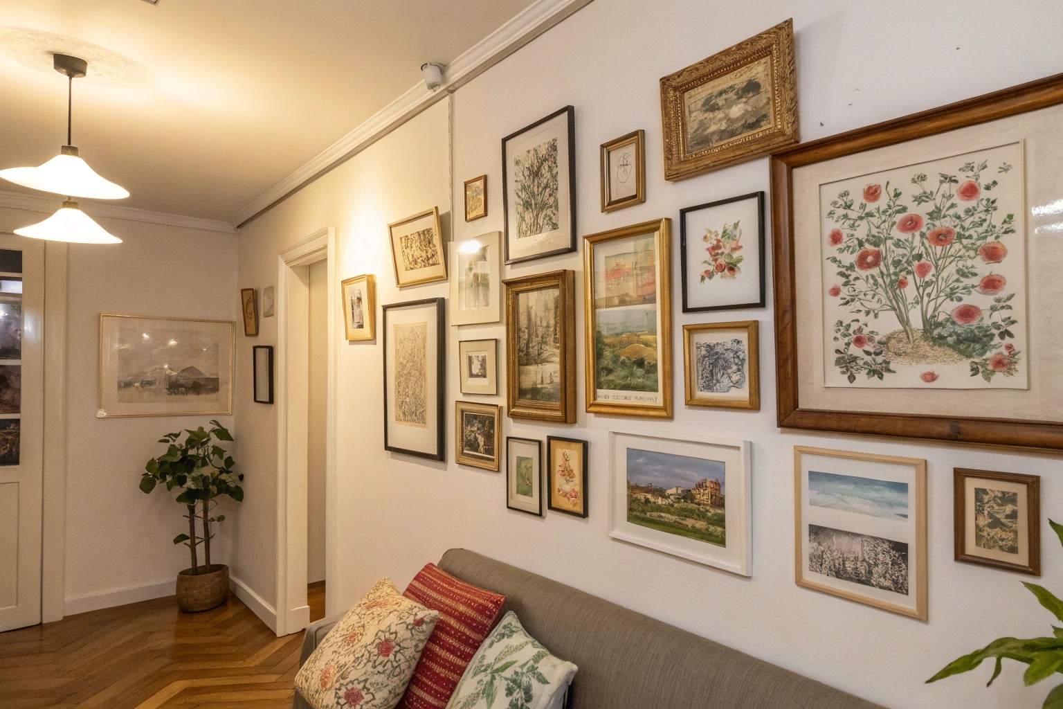
Creating a meaningful mini gallery wall transforms even the smallest spaces into powerful storytelling zones that reflect your unique perspective and experiences. Whether you’re working with a narrow hallway, a cozy reading nook, or that awkward corner behind your desk, the right approach can turn limited square footage into a compelling visual narrative.
Understanding the Mini Gallery Advantage
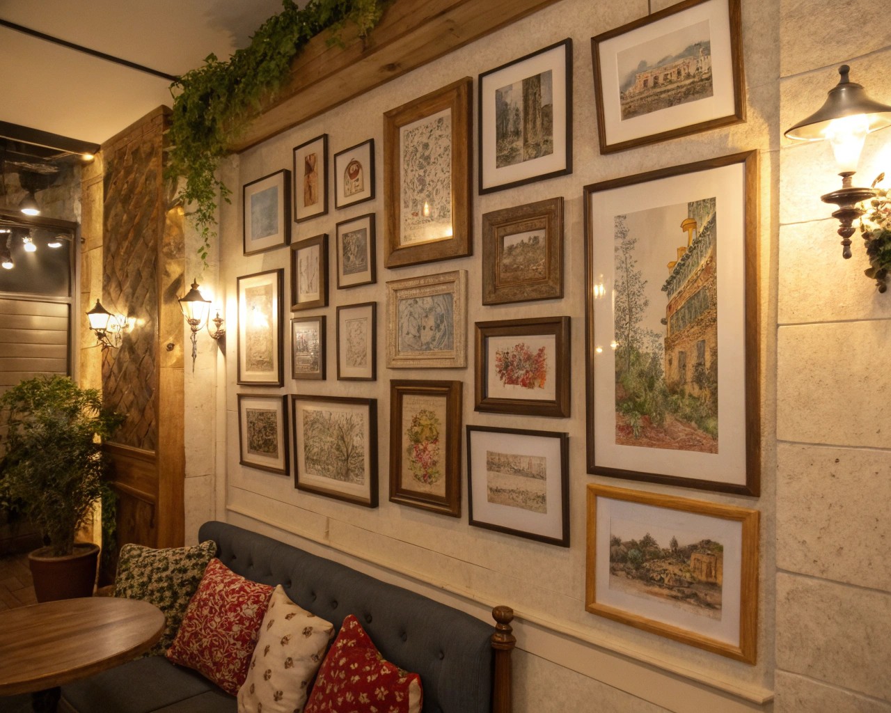
Mini gallery walls offer distinct advantages over their larger counterparts, particularly in how they function within intimate spaces. Unlike expansive gallery installations that can overwhelm smaller rooms, a thoughtfully curated mini collection creates visual impact without competing for attention.
The key difference lies in intentionality. With fewer pieces to work with—typically two to four artworks—each selection carries more weight in the overall composition. This constraint actually becomes an asset, forcing you to choose pieces that truly resonate rather than filling space arbitrarily.
Core Benefits of Mini Galleries:
- Flexibility to relocate as needs change
- Lower financial investment for high-impact results
- Easier to maintain visual cohesion
- Perfect for rental properties or temporary spaces
- Opportunity to showcase statement pieces effectively
Strategic Space Assessment
Before selecting artwork, conduct a thorough evaluation of your available wall space and its relationship to the surrounding environment. The most successful mini galleries work in harmony with existing architectural features and furniture placement.
Measuring and Mapping Your Canvas
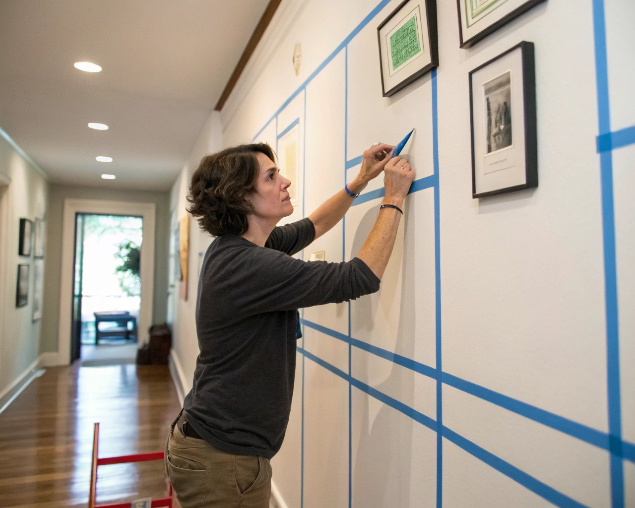
Start by documenting the precise dimensions of your target wall area. I recommend using painter’s tape to outline potential gallery boundaries, which helps visualize the space without making permanent marks. This technique proves especially valuable when working around furniture or architectural elements like doorways or windows.
Essential Measurements to Record:
- Wall width and height available for artwork
- Distance from floor to furniture (if applicable)
- Ceiling height for vertical proportion planning
- Clearance around light switches or fixtures
- Viewing distance from primary seating areas
Contextual Considerations
The room’s existing color palette, lighting conditions, and traffic patterns significantly influence gallery placement and artwork selection. A mini gallery in a high-traffic hallway requires different considerations than one positioned above a reading chair.
Natural light exposure affects both artwork preservation and visual impact. South-facing walls receive intense, potentially damaging UV exposure, while north-facing surfaces offer consistent, gentle illumination ideal for artwork display.
Artwork Selection and Cohesion Strategies
The limited real estate of a mini gallery demands careful curation. Each piece must earn its place through either strong individual merit or its contribution to the collective narrative.
Building Your Collection Theme
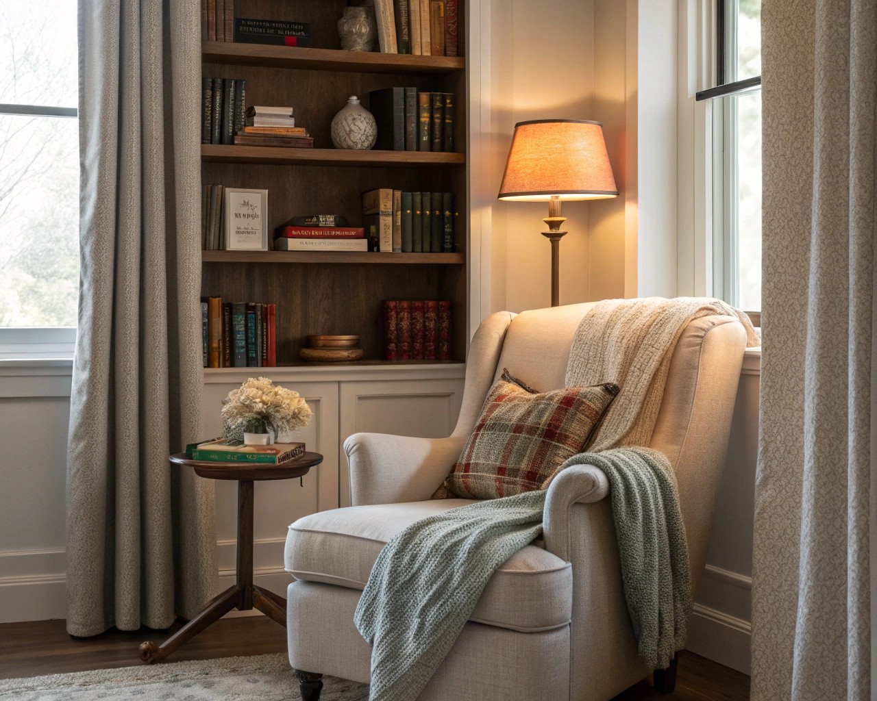
Successful mini galleries often center around a unifying concept that creates visual and emotional coherence. This doesn’t require literal interpretation—subtle connections through color, texture, or mood prove equally effective.
Proven Thematic Approaches:
- Monochromatic schemes: Various artworks sharing a color family
- Subject matter focus: Landscapes, portraits, or abstract works
- Medium exploration: Photography, watercolors, or mixed media
- Personal narrative: Travel memories, family history, or milestone moments
- Seasonal rotation: Changeable themes that evolve throughout the year
Scale and Proportion Guidelines
In mini galleries, scale relationships become critically important. I’ve found that including one dominant piece—typically 40-60% larger than accompanying works—creates visual hierarchy without overwhelming the space. This approach mirrors natural focal point creation found in successful landscape design.
Size Distribution Formula:
- One primary piece: 16″ x 20″ or 18″ x 24″
- Two secondary pieces: 11″ x 14″ or 8″ x 10″
- One accent piece: 5″ x 7″ or 8″ x 8″
Layout Design Principles
The arrangement phase determines whether your mini gallery reads as intentional design or random placement. Successful layouts balance structure with organic flow, creating visual paths that guide the eye naturally through the composition.
The Foundation-First Method
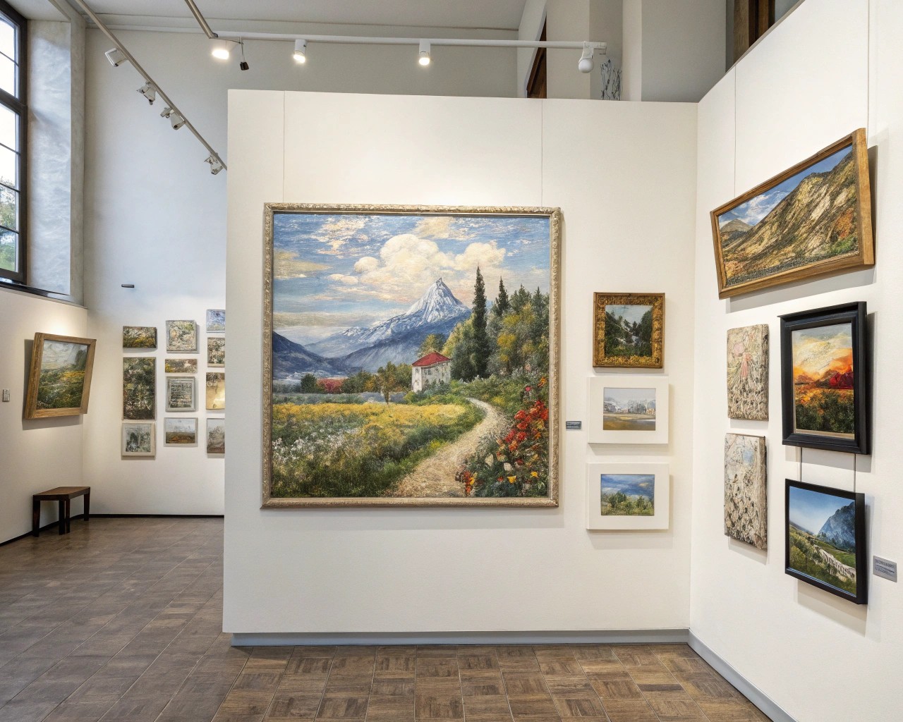
Begin with your largest or most visually dominant piece as an anchor point. Position this primary artwork slightly off-center rather than dead center—this creates more dynamic visual movement and prevents the static feeling that perfectly centered arrangements can produce.
From this foundation, build outward using the diagonal principle: place your second most important piece diagonally from the first, either adjacent or across the composition. This creates visual tension that keeps the arrangement engaging.
Grid vs. Organic Arrangements
Grid Layouts work exceptionally well for mini galleries when executed with consistent spacing. The clean lines create sophisticated visual calm, particularly effective in modern or minimalist interiors. However, with only 2-4 pieces, grids can appear stark unless carefully balanced.
Organic Arrangements offer more flexibility and visual interest for small collections. These free-form layouts allow for varied spacing and create more dynamic compositions that feel less rigid.
Frame Selection and Coordination
Frame choices significantly impact the overall cohesion of your mini gallery. With fewer pieces to work with, frame inconsistencies become more noticeable, making thoughtful coordination essential.
Mixing Frame Styles Successfully
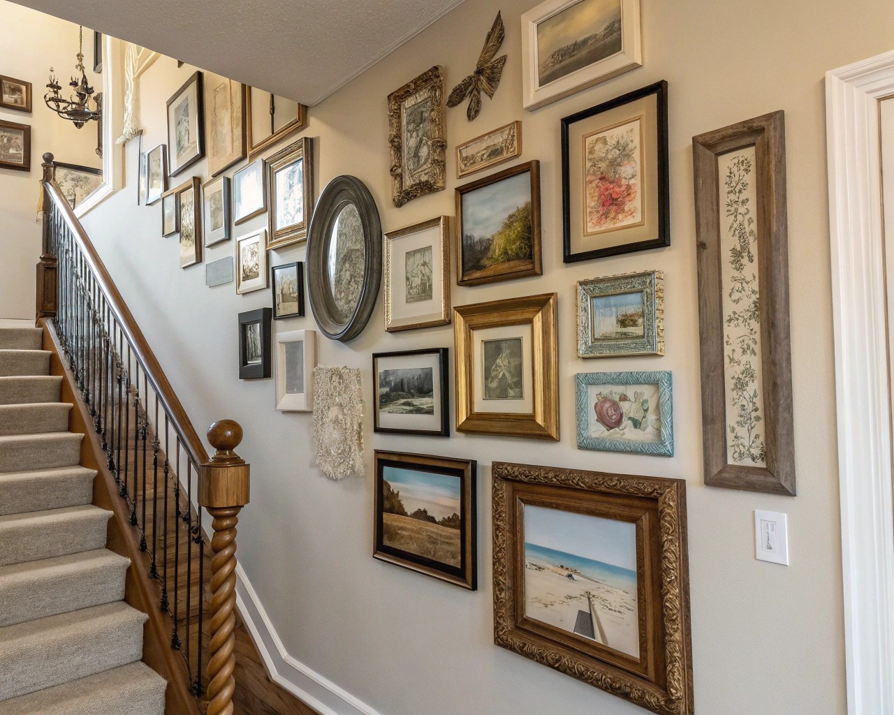
The general rule allows for two to three frame styles maximum in a mini gallery setting. More variety creates visual chaos rather than sophisticated eclecticism. I recommend starting with two coordinating styles and adding a third only if it serves a specific design purpose.
Effective Frame Combinations:
- Black metal + natural wood + single accent frame in brass
- All white frames in varying profiles (thin, medium, thick)
- Two wood tones (light + dark) with consistent profile styles
- Matching frames with varied mat treatments for subtle diversity
Matting Strategies
Strategic use of matting can unify disparate artwork or create breathing room around busy compositions. In mini galleries, consistent mat treatments often prove more effective than varied approaches.
Standard mat proportions call for equal margins on three sides with a slightly larger bottom margin—typically 25% wider than the top and sides. This subtle asymmetry prevents the optical illusion that makes bottom-heavy compositions appear to slide downward.
Installation Techniques and Tools
Proper installation ensures your mini gallery maintains its intended visual impact while protecting both artwork and walls. The reduced scale doesn’t diminish the importance of precise hanging techniques.
The Template Method
Create paper templates matching each frame’s exact dimensions before making any wall marks. This allows unlimited repositioning without nail holes. I prefer using brown kraft paper or the backing paper that comes with new frames for template creation.
Step-by-Step Template Process:
1. Arrange frames on the floor in your desired layout
2. Trace each frame onto paper, marking hanging hardware placement
3. Cut out paper templates and tape to wall
4. Step back to evaluate proportions and spacing
5. Mark nail locations through paper
6. Remove templates and install hanging hardware
7. Hang frames using predetermined positions
Hardware Selection
Choose hanging hardware appropriate for both frame weight and wall type. Standard picture hanging nails work for lightweight frames on drywall, but heavier pieces require wall anchors or screws driven into studs.
Weight-Appropriate Hardware:
- Under 5 lbs: Standard picture hanging nails
- 5-15 lbs: Drywall anchors or molly bolts
- 15-30 lbs: Toggle bolts or screw into wall studs
- Over 30 lbs: Professional installation recommended
Styling and Finishing Touches
The details that surround your mini gallery often determine whether it feels intentionally designed or accidentally assembled. Consider lighting, adjacent furniture placement, and decorative accessories as integral components.
Lighting Considerations
Proper lighting transforms artwork from wall decoration into gallery-quality display. Track lighting, picture lights, or strategically placed table lamps can dramatically enhance visual impact, particularly in evening hours when natural light fades.
Avoid direct lighting that creates harsh shadows or glare. Instead, aim for gentle, angled illumination that highlights textures and colors without creating distracting reflections on glass surfaces.
Integration with Surrounding Elements
Your mini gallery should feel connected to its environment rather than floating independently. This might involve echoing colors found in nearby textiles, coordinating with existing furniture finishes, or selecting artwork that complements architectural features.
Environmental Integration Techniques:
- Echo dominant room colors in artwork selections
- Coordinate frame finishes with existing hardware
- Consider scale relationships with nearby furniture
- Balance visual weight across the entire wall
- Integrate with existing lighting schemes
Common Mistakes and Solutions
Even experienced designers encounter predictable challenges when creating mini galleries. Understanding these common pitfalls helps avoid costly mistakes and revision cycles.
Scale Mismatches
Problem: Artwork too small for the available wall space creates a “floating island” effect
Solution: Either group multiple small pieces together or select larger individual artworks that better fill the space
Problem: Oversized artwork overwhelming a small wall area
Solution: Move to a larger wall or create visual balance through surrounding elements like furniture or architectural features
Hanging Heights
Problem: Artwork hung too high, breaking the visual connection with viewers
Solution: Position gallery centers at 57-60 inches from floor level, adjusting down when hung above furniture
Color Conflicts
Problem: Artwork competing with bold wallpaper or strong paint colors
Solution: Add wide mats or select frames with substantial profiles to create visual separation
Seasonal Adaptability and Evolution
One advantage of mini galleries lies in their manageable scale for seasonal updates or evolutionary changes. Unlike large installations that require significant time and effort to modify, mini galleries can adapt to changing tastes, seasons, or life circumstances.
Consider creating modular systems that allow easy artwork rotation. Picture ledges, for example, enable frequent rearrangement without new nail holes. This flexibility proves particularly valuable for renters or anyone who enjoys refreshing their environment regularly.
Rotation Strategies:
- Seasonal color palette changes
- Holiday or celebration themes
- Personal milestone documentation
- Artwork acquisition integration
- Experimental layout testing

